
Late 2022, Product Design was challenged to envision the future of Clio. This included many explorations — from design principles to heuristics — which formed into working groups. Among these was the look and feel group. As a part of this group, I helped create our new Boldly theme for the design system and for communicating updates across the front end engineers and designers.
ClioDS is our new design system built on the Rails Front End (RFE) framework, marking our shift away from AngularJS. Within ClioDS are two themes; the legacy theme Apollo and Boldly Clio which represents the new direction of Clio. Boldly Clio is inspired by the distinctive personality of Clio, its unique voice and our refreshed design principles.
Chapter 1: Explorations and convergence on Boldly Clio
How did we arrive at Boldy Clio? It started with the Look and Feel working group. We went far and wide with our explorations, eventually landing on one of our designer's concepts named Boldly Clio (Kelsey Bowman, a designer I deeply admire). We took the concept through several more iterations on typography, colour and accessibility.
Chapter 2: Colour as the foundation
A thoughtful colour palette serves as the visual foundation of a design system. The previous colour palette was disorganized and muted. There were multiple blue palettes and extended colours with no consistency being used haphazardly across the application. It was crucial to establish a solid foundation for the design system through the creation of colour tokens.
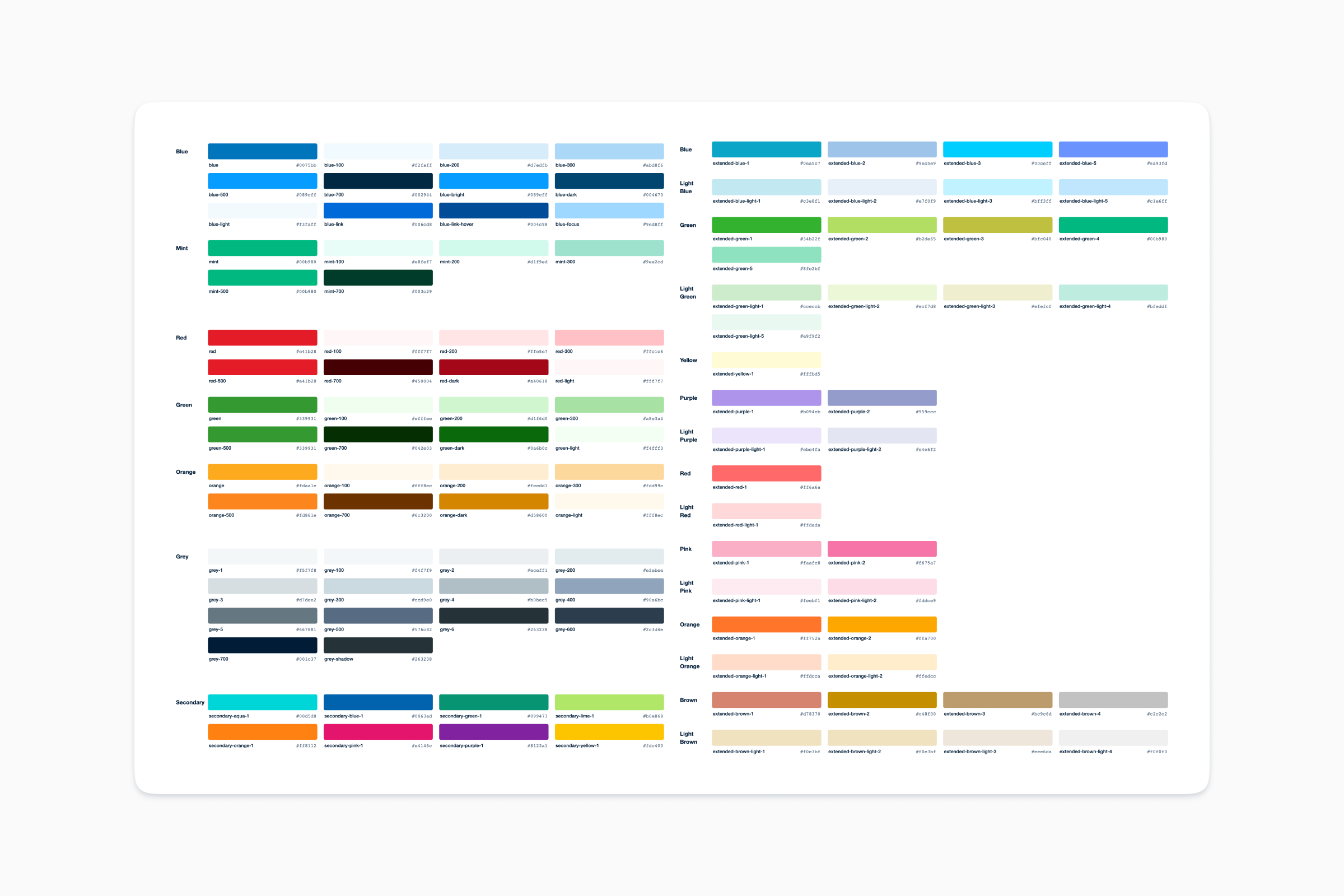
Our old theme Apollo had an extensive extended colour palette with no clear guidelines on when, where and why each colour should be used. There were also colours introduced that were very close to other shades, making it even more difficult to ascertain what the use case for each colour was.
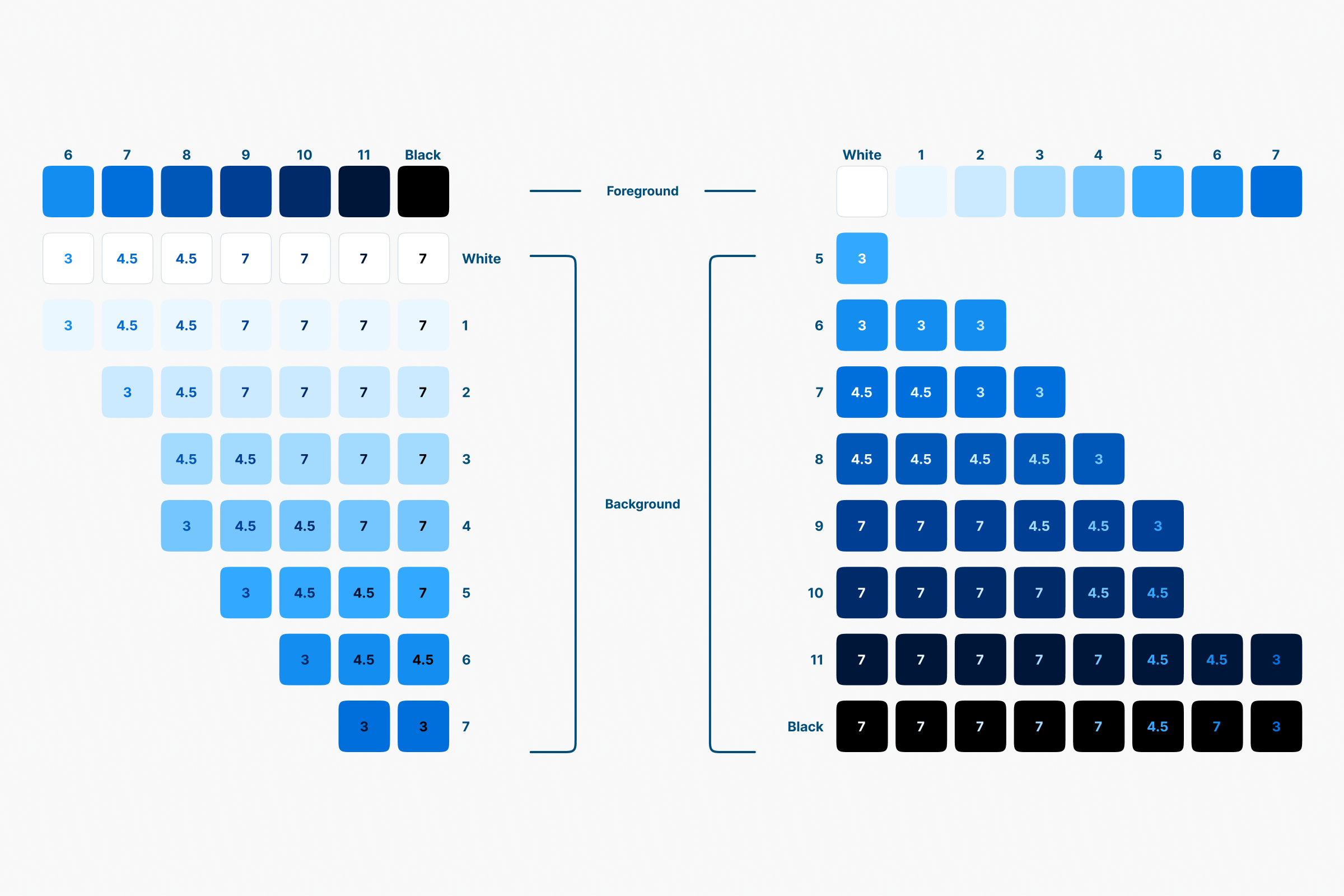
To unify and standardize our colours, I created nine palettes with an algorithm, encompassing the full spectrum. Each palette underwent subsequent tweaks to ensure particular colour combinations would adhere WCAG Success Criterion 1.4.3 for contrast ratios. For example, I ensured that shade 700 for all colours were accessible on shade 100 colours, as we use shade 700 as the text colour on shade 100 which is used for surfaces.
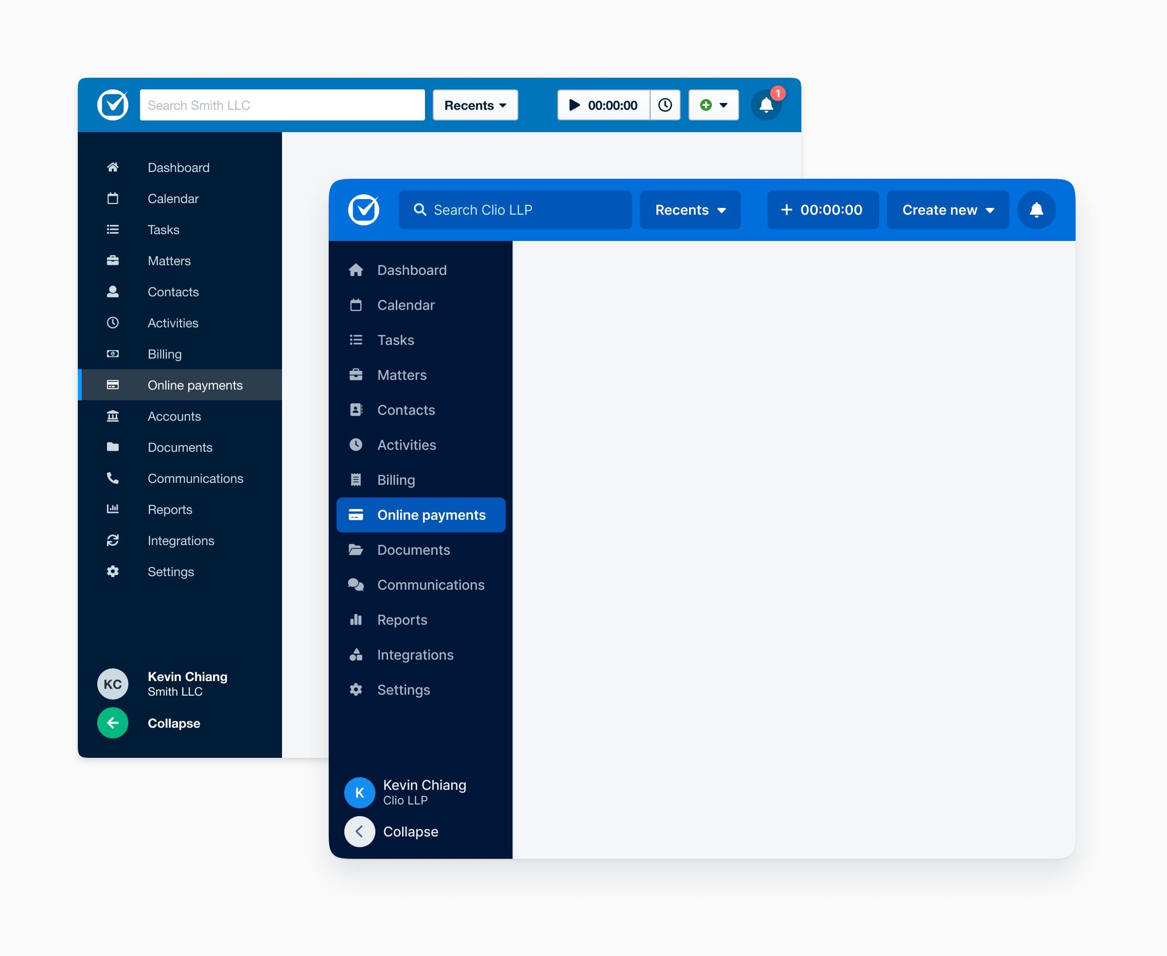
Chapter 3: Global navigation
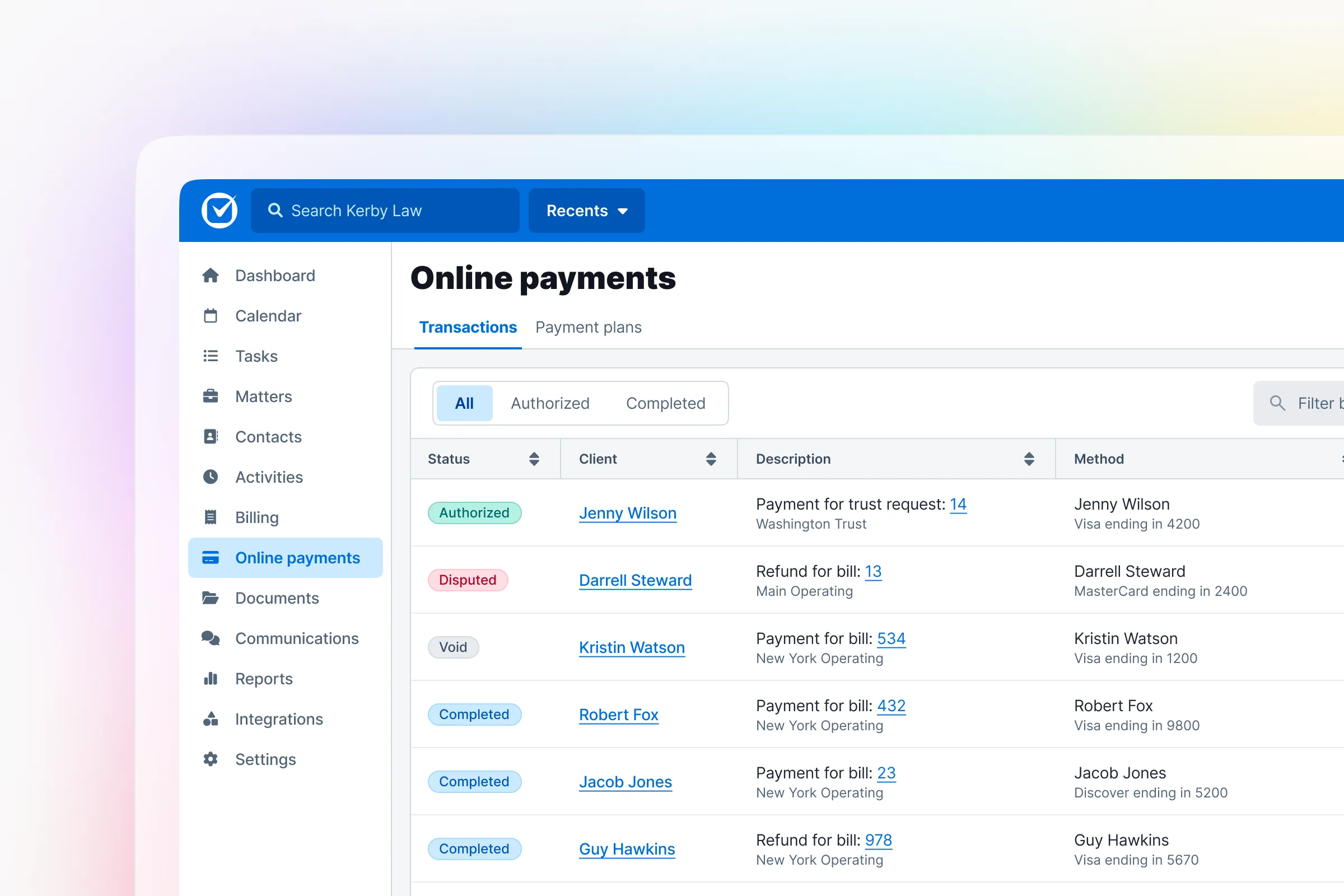
One of the biggest changes was the makeover of our global navigation sidebar and shell bar. We revitalized the shell bar with our newly introduced primary blue, and the global navigation was refined with shades of our blue and grey palette.
Chapter 4: Core Components
I helped redesign many of our core components including forms, controls and our data table. I was also responsible for conducting quality assurance with engineering on our components as the front-end infrastructure team developed them.
UNDER CONSTRUCTION, TO BE ADDED...
Feedback
Incredible work on improving our DS through collaboration and a desire to move the design bar here at Clio. Great thinking, even greater action and execution on the type proposal. Thank you both for making our DS better at Clio, and thank you for the passion shown this week!
Stephen McGuinness, Senior Product Designer